
The journey of the Marine Gateway project through city hall is one worth following.
This, for those who haven’t read it before, is the largest development ever considered for rezoning outside the downtown. It will also, I believe, set a certain level of expectation for the kind of density that might be considered for other transit stations on the Canada Line and elsewhere.
As those who were at the urban-design review panel meeting Wednesday heard, as part of the planning context for the building, the city is considering density for much of the length of Cambie between 25th and Marine Drive to capitalize on the new Canada Line and its stations. Four to six stories in some areas, like around Queen Elizabeth Park, six to eight stories around King Edward, potentially something similar around 33rd, where a future station might go in, a node of even higher buildings around Oakridge, more density along the “transit corridor” from 41st to 49th, and then a tapering off to residential down to Marine.
Then at Marine, there’s intended to be a very high-density node, with the PCI/Gateway building the highest, but buildings on the other three corners and within 500 feet going up to 15-20 stories in some cases, it looked like to me. The gas station on the northwest corner and the little complex with the Chinese restaurant on the northeast have already been bought or optioned, it sounds like, and developers are already working on towers for those sites. (In fact, three panel members normally there — Jim Cheng, Maurice Pez, and Jim Huffman — had to abstain from voting because they are working for one or the other of those developers and so had conflicts to be avoided.)
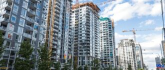
So what happens with the node at Marine and Cambie, where the PCI group is proposing a near-million-square-foot development with a residential tower of 350 feet, along with a smaller office tower, an 11-screen theatre, and a retail complex, is important.
The project was not supported at the urban design panel on Wednesday night, as I noted, in a 5-4 vote.
I should note, for those who think it was a close vote, that almost everyone said similar things, with a few exceptions.
Most of the panel said they didn’t have a problem with the density on the site. Most felt the project, designed by Vancouver architect and green-building champion Peter Busby, carried out a lot of the principles the city had for the site. No one had an objection to the mix of uses or the residential on the site. They voted no and yes according to what looked like individual assessments of whether their general support for the project was outweighed by this or that concern that they raised. People were actually quite excited about having a big, visually distinctive building and project there. They thought it was great to have a project connected to a transit line and to have a node of density outside the downtown.
Architect Steve McFarlane said he saw it as “the capacity to be a really visible project and a true catalyst.” Landscape architect Jane Durante said she thought it would be a “fantastic anchor for the south end of Cambie. It’s ambitious and bullish and I look forward to it.” Architect Scott Romses said he didn’t have a problem with the height and he liked the idea of “this little node being a fragment of the downtown, a nice exclamation mark for this corridor.” Architect Oliver Lang said he really supported the idea of the density, the mix and the height.
The panel member who voiced the most concern was chair Bruce Haden, who spoke last and split what looked like a 4-4 tie vote. Haden said he thought the project was just too dense and would create a public backlash against future projects.
“I don’t think this will foster a positive civic discussion about density. I think it will increase people’s fear about density. And I actually think this project’s too big.” Haden noted that when buildings taller than average are proposed downtown, they have to meet a very high standard of architectural excellence. He thought a project outside the downtown, while only as high as the average downtown building, would have such an impact on the surrounding area that it too should have to meet a very high standard of architecture. And he observed that the project was too self-contained, too much like its own little spaceship (my words, not his), and not integrated enough into the neighbourhood and space it was in.
Surprisingly to me, the size of the building was not the main topic of conversation, even though it’s something like 37 stories high and, at its widest, a 250-foot wall running north-south right next to the transit line. People had different reactions to the design and whether that contributed to a sense of the building being “ominous” or “imposing.” For those who haven’t seen it, the taller tower on the site it’s an unusual design that looks like separate rectangular boxes stacked on each other in a step formation. It’s typically Busby — striking, distinctive, with really strong lines and a very unified look; not at all some of the cross-hatched, fussy and collage-style buildings, with a little of this and a little of that, around town.
Scott Romses’ only complaint was that it wasn’t bold enough. “It’s bold, it’s a marker. I want to push you to make it bolder and less conventional.” Jane Durante, who has a wealth of experience working on large projects in this city, said she round the residential tower awkward, visually upsetting and very bulky. She wanted to see something taller and thinner so there wouldn’t be such a wall-like face. Steve McFarlane said the massing had the potential to be quite an ominous presence. “There’s a heaviness in the massing, exacerbated by the cantilevered approach.” (Cantilevered means when some part of a building or structure inside a building hangs out without the usual vertical support.) Only landscape architect Robert Barnes commented, like Haden, that he thought it was just too big.
Interestingly, what took up a huge amount of time at the two-hour review was a discussion of the “high street” that the design team had created between the big residential tower and the smaller office tower at a level that would mesh with the SkyTrain entrance. (As far as I could tell, it was level with the street on the north/Marine Drive side, but much higher on the south end of the complex because of the 16-foot drop between north and south.
Everyone on the review panel talked about the problem with that street not really connecting to the street outside and therefore being unlikely to draw in commuters coming to catch the SkyTrain. Instead, they worried, pedestrians would walk down the narrow sidewalk remaining on Cambie and go up to the platform that way.
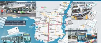
Personally, I found that concern perplexing as I can’t imagine that station will actually have a lot of pedestrian traffic from Cambie or Marine. It’s a hideous five-way intersection that no pedestrian in his/her right mind would want to go near. As one person who works in the area commented, “No one walks along Marine there. And when they do, they get killed.” Most people would come to the Gateway project, I think, by transit (they’re expecting the site to generate 5,000 extra riders a day for the Canada Line) or on one of the 500 buses that come into the loop to the south of the project or by car. So the excessive concern for thundering herds of pedestrians storming down Cambie seemed strange. On the other hand, if that area does become a tall-building node, perhaps people will stream out of their condos on the north side to the south side and I know nothing.
Anyway, the biggest thing that everyone kept going around was that the high street created inside the project would come to Marine Drive at mid-block and so no pedestrians would likely walk that half-block over to get inside the complex. Thus, there was a risk the complex would be dead and empty, which would affect the retail and would generally create another strange Tinseltown (my analogy, not theirs).
There were a lot of suggestions about making the high street start right at the corner and then curve around into the centre of the complex.
Other points: praise for the mobility centre, a place for people to store bikes, much better designed than the rinky-dink things now on the Canada Line; praise, mostly, for the Spanish steps sloping down from the high street on the south end of the site. Some concerns about the office tower also being too bulky, even though smaller.
So it’s back to the drawing board for the team, but it doesn’t sound to me as though the panel overall has a huge problem with density or height in that area. There are more open houses coming up and then a public hearing, where all the non-architects in the city get to weigh in.